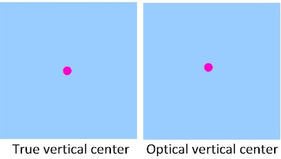
The optical center is a concept that demonstrates that it can be better if you use what looks right rather than what measures right. Because the true vertical center often looks too low, if you want something to appear equidistant from the bottom and top, position it a little bit above the true center. (The dot on the right is probably a bit too high.)

[above] Sometimes what you see (or think others will see) is more important that what you measure. The upper line shows normal letterspacing. The lower line shows that some adjacent vertical letters benefit from increased spacing, and that adjacent round letters, which diverge from their closest points, look better with less spacing.

[above] The upper line has normal letterspacing. The lower line looks better because letterspacing was decreased (“kerned”) to compensate for the diverging letterforms.


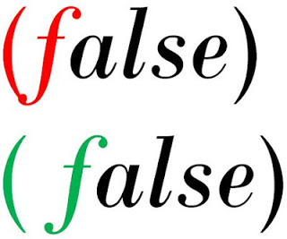
[above] Parentheses and brackets may be too low to look right in large sizes. Change the vertical alignment (within Font settings in Word). There is probably no need to do this in text sizes.
[above] You may have to add additional space to keep a letter, number or symbol from crashing into a parentheses or bracket. Height and spacing adjustments will vary with character, typeface, case and tilt (roman v. italic or oblique).

[above] Hyphens, em dashes and en dashes may have to be raised a bit in large type.

[above] The height and relative size of the “@” symbol varies greatly among typefaces. In large type sizes, experiment with lowering and/or enlarging the symbol so it aligns better with adjacent text.
By the way, if you are interested in Minecraft guides and tutorials, you should definitely check out MiningCubes.